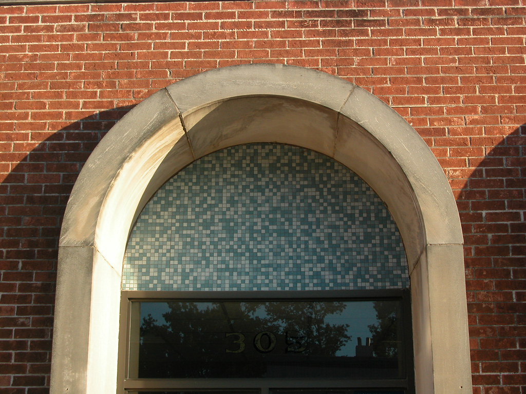
 Valley Park, Missouri has a little Modern Movement United States Post Office that packs a large architectural wallop. Located at 305 St. Louis Avenue, essentially the building is a one-story brick box. There are no frills. The building's only attempts at style come through function -- namely, windows and doors, which every building must have.
Three tall, Roman-arched entrances on one side, trimmed in thick projecting limestone bands that reach up from the ground to form full surrounds. Two windows on the other side, also trimmed in limestone, create a lop-sided counterbalance. Inside of the mightly, heavy Roman arches are upper blinds filled in with small blue tiles whose delicacy contrast pleasantly with the stone surrounds. Power and grace balance each other as a solid doorway to enter the post office also provides the eye with a small delight on entrance.
 Much modernism fails at such small but important gestures. This post office does it well, without pretending to be more than what it is -- a small, small-town post office. This is the side of modern architecture that pulled the human scale out of minimal expression. After all, buildings are for people. essentially, those which are most functional should be -- but rarely are -- the most humane. Count the Valley Park Post Office among those that manage to be both.


6 comments:
Modern architecture fails...period.
Wow... Thats what they thought about 50 year old architecture in the 1950s. Consequently a large section of Compton Heights fell off the face of the earth in order to build an interstate highway. Mid-century buildings are not my favorite either, but they certainly have historical significance.
How many objectively ugly buildings do we need to keep standing? History? Unlike any architectural movement in history, the Modernists made a complete break from the past. That was their driving worldview and it shows. By definition, Modernist architecture is disassociated with history. I say bulldoze the lot of it and pick up where we got off the rails. Unfortunately, it would probably be replaced with vinyl and aluminum kitsch.
Again, I'm partial to older buildings as well, and I agree that many very ugly MCM buildings exist, especially in St. Louis. On the other hand, there are a great deal of architecturally significant buildings from that era that are really quite beautiful. But that is only my opinion.
So lets say we took all the aesthetically displeasing ones and knocked them down. Then what? We all know, and Jeff agrees, that after the demolition of those buildings would come a series of crap built with weak lumber, fake brick and plastic sides. Then what? Tear those down in twenty years and put up new again? Next thing you know we could be a completely disposable society where watches, vacuum cleaners, diapers and now houses, apparently, are all "throw away" items.
Maybe we should all buy mobile homes. It would have to be cheaper to cart off a house with wheels than to actually go to the expense of demolition.
Brian. It is indeed a quandary and you make a very legitimate point. While dehumanizingly ugly, many of the Modernist buildings were very well constructed and there are even a few to which I am partial. So I amend my position. If given the choice between a well constructed Modernist structure and cheap contemporary kitsch, I would prefer the Modern building.
I will even say that it disturbs me to see folks take those Modernist buildings and kitschify them with the latest rage in vinyl clad trappings. They should at least remain consistent to their era, including the interior appointments.
And, Jeff, I think we've come back to you original statement which we can revise just slightly: [Modern architecture fails] when you destroy it with interior and exterior appointments inconsistent with the era in which they were constructed...[period].
Post a Comment