
 What's wrong with this picture?
If you answered "two perfectly fine mid-century buildings have been given ugly pink brick socks," you are right. This is a view looking northwest across Fourth Street at the Gentry's Landing apartment tower and the three-story office building to the north. These buildings are part of the Mansion House Center, whose three nearly-identical towers and three nearly-identical office buildings are part of an urban renewal project completed in 1966 and designed by renowned St. Louis architects Schwarz and Van Hoefen. The Mansion House Center is a solid work of mid-century architecture, although like many of its contemporaries is somewhat hostile to its urban setting. The buildings are a homespun working of Mies van der Rohe, replacing the sleekness of pure glass and steel compositions with a more pedestrian mix of glass, steel and concrete.
The Mansion House Center is connected by a large parking garage on the east with a delightful upper garden deck. The garage blocks Olive, Locust and St. Charles streets to form a super-block, and is interrupted only by the already-extant Peabody Coal Company Building (1958, Ralph Cole Hall) and a former Washington University alumni club building built as part of Mansion House Center. The garage causes the project to present a public face to Fourth Street and a dull, mostly-utilitarian wall to the Arch grounds on the east.
However, the towers and office buildings were meant to harmonize with the new monument. Schwarz and Van Hoefen designed the Mansion House buildings to frame view of the Arch through downtown with equally-modern architecture. The architects wisely avoided upstaging the Arch with innovative design, instead providing an architectural supporting player. The garage's monotony belies the fact that its garden roof was supposed to extend the lushness of the Arch grounds into downtown via a unique vantage point. Architecturally, Mansion House does well, although functionally its garage is a barrier between downtown and the Arch grounds that could stand some alteration. (Read Steve Patterson's ideas for changes here at Urban Review.)
Yet none of the needed alteration involves changing the architectural vocabulary of the Mansion House buildings, whose minimal modern lines evoke the mid-century optimism of St. Louis and only enhance the presence of the Arch. The pink brick applied to the column bases at Gentry's Landing and its neighbor undermine the grace of the original architectural gesture by making the buildings stick out. Perhaps this gesture is good for leasing apartments, but it is not good for the street scape on Fourth Street.
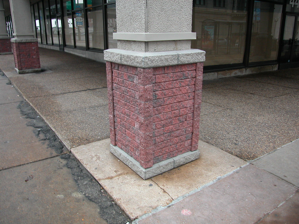 Up close, the brickwork reveals itself to be thin applied rough-faced brick sandwiched between fake stone. The contrast between these bases and the straight lines of the pale concrete columns could not be stronger. Additionally, the columns have been given little concrete bump-outs above these bases.
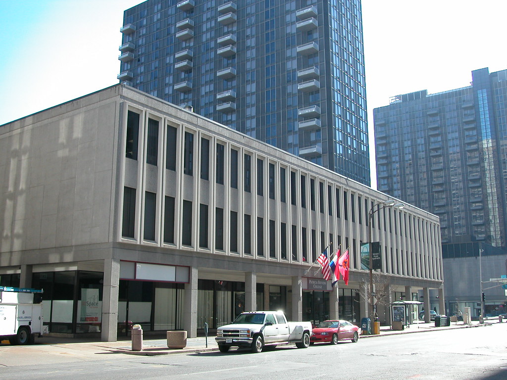
The photograph above shows the original appearance of the column bases of the next office building south of Gentry's Landing, which falls under different ownership. One can see how the straight lines of the columns accentuate the projecting window surrounds of the upper two floors.
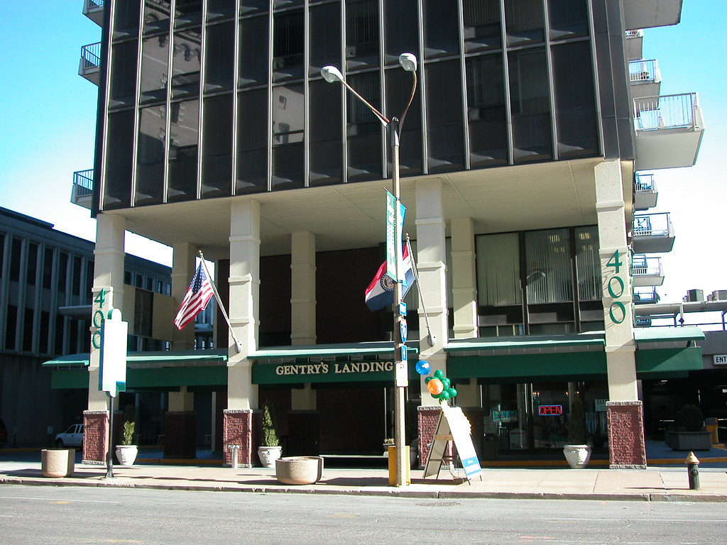 The restrained modern entrance to Gentry's Landing is now ablaze with the pink brick bases, a yellow paint on the concrete and green signage. Yes, times change, and developers need to be profitable, but there are many ways to make changes and make money without making bad design decisions. In fact, bad decisions might turn out to be less profitable in the long turn as applied materials age and appear dated while original materials -- even mid-century concrete, I submit -- retains a sobriety that is attractive.
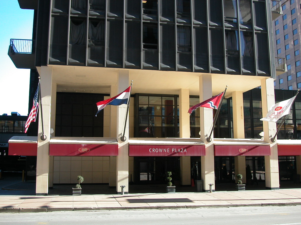 The entrance of the south tower at Mansion House Center retains its original appearance despite changes of use (apartment to hotel) and addition of awnings (which can be removed). The curved concrete canopy and hotel lobby have been extended through replication of form and material. Changes here have retained the modern lines of the building.
Alas, the Gentry's Landing project is not the only remodeling project to mar a mid-century building on Fourth Street. Just to the north across Washington Avenue is one of the worst architectural slipcover jobs to hit downtown St. Louis, the 2003 conversion of the former Bel Air East into a Hampton Inn.
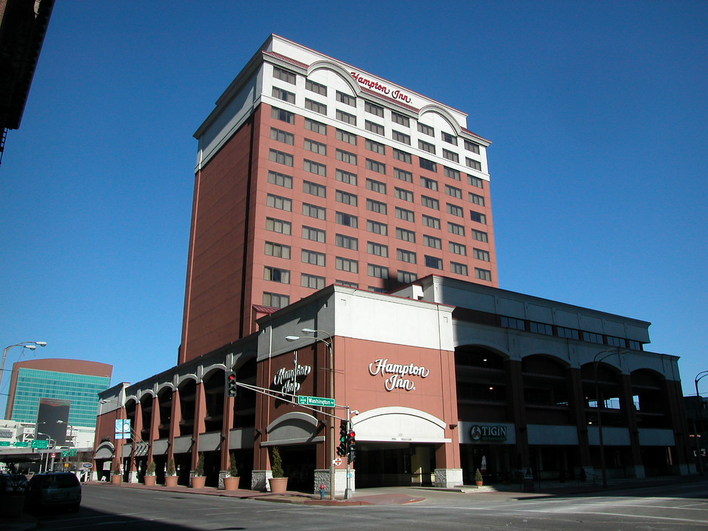 Opened in 1964 replete with a Trade Vic's tiki lounge, the Bel Air East was also a complementary modern building that embraced its location near the Gateway Arch. While the Bel Air East was imperfect, none of its flaws justified the complete covering of the building in pink EIFS. The result of the cladding project is reminiscent of the works of the 1980's American postmodern classical movement -- that is, dull and pretentious.
Of course, one could take the retroactive view further back in time and look at the Adam's Mark Hotel, whose 1985 construction entailed the complete covering of the Pierce Building (1906, Frederick Bonsack) with flat gray granite and unarticulated brown brick. That disaster destroyed an earlier office building in favor of a work of architecture that doesn't even deserve the descriptor "mediocre." Who knew that what happened to the Pierce would happen again to the street's mid-century buildings?


8 comments:
I can't believe someone actually spent money on this.
Those pink socks... are you f##king serious??? People should have been fired for that.
Don't even get me started on the Hampton Inn. Absolutely the tackiest reclad job in history. How come St. Louis always manages to pull off awful redevelopment projects, yet when something smart, sensible and asthetically pleasing is proposed, it gets stalled? Why can't some of these horrid building renovations such as the ones documented in this post fall through? This city is so progressive at being regressive.
OMG, those are horrible!
I agree - the "socks" are distracting and obviously out of line with the aesthetic. It's almost worse that the fantastic signage is still intact because you it makes you so aware of what was.
The real travesty is the attempt to assimilate with the Hampton Inn. An instantly dated, and pretentious (good call) renovation.
Who is the firm/contractor responsible, do you suppose? I would be very interested to hear about the justification for that change.
Great Blog!
I noticed this when we walked by coming back from Shady Jack's, but I don't think it hit me just how bad it looks until right now. If they were really looking to improve the entrance, they could have started by replacing the broken and uneven concrete along 4th St.
I still miss the giant tiki heads out in from of the Hampton Inn.
Mmmm, bad cheese. You'll also notice they carried the concrete brick topper "band" or ring up the columns. I do hates me some (add-on) split-face brick and concrete, yessir. Have to agree on the hotel, too. That color, Dog damn!
Well, I really don't mind 'em. Neither the color (though I'm not a fan of pink) or the way it breaks up the lines of the building.
It's trying a bit to hard to say, "Look at me! I'm more than an boring looking office building. I have a quirky character. Look at my new socks!"
Admittedly, I've never been keen on the mid-century clean lines thing. They just look boring to me.
Post a Comment