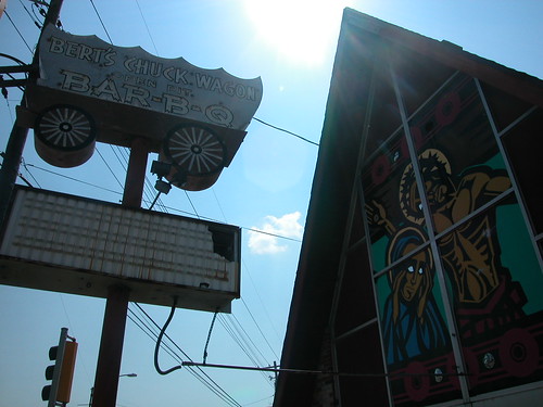
 The Madison County Journal reports that Collinsville mid-century landmark Bert's Chuck Wagon Bar-B-Q (see "Heavenly Bar-B-Q" will be demolished soon for widening of Illinois Highway 159. Bert's Chuck Wagon will relocate to a nearby location on Main Street and move the fine conestoga sign to the new location. The A-frame building with the vivid religious scenes painted in its gable end windows, however, will be history.
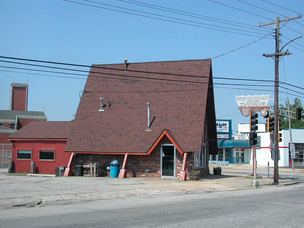
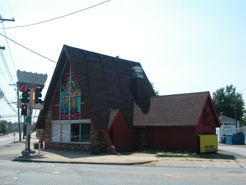 The widening of Illinois 159 costs the state $56 million, and the sites of several tax-paying small businesses -- not to mention at least one landmark mid-century building. Such an expensive project in recession may very well take away more economic activity over the long run than it generates.
See also "Mid-Century Modernism in Collinsville" (August 8, 2008).